We are in 2019 and design trends have brought a revolution. We could see many new design trends emerging in the market. And we should be expecting to see more. So, let's see some of the design trends in 2019 so far.
Use of Vivid Color
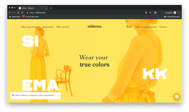
This year, users are craving high contrast and vibrant colors. Now more than ever, companies are using bold bright colors to better represent the company brand. Vibrant color stands out from the background and pulsing with energy. Designers use vibrant colors to make people focus their attention on important elements and make their design memorable.

Motion Graphics
Videos are bolder and more eye-catching than ever. The key is finding the right balance so your written copy and videos don’t compete for the user's attention.
Functionally, videos are more product-focused to help your website visitors understand how your product works and how it will benefit them.
The best videos hook the user in the first few seconds and don’t require sound to be efficient. Use time-lapse videos or sequencing techniques to make your product appear easy to use.
Eg: Lyft, Uber, Hamilton Family Brewery,
Here we can have any motion picture in the replacement of the video that can attract the viewer's attention like in Lyft Rider, they are using GIFs that display the multiple-image clipped inside the ‘Y’ as their identity and Mailchimp have put the subtle movement in the butterflies in their hero image. The storytelling through multiple animation and character as seen in Inturn.
Organic Shapes
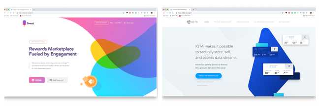
Organic shapes are naturally imperfect and asymmetrical, they can provide depth to a web design that makes page elements stand out. They are based in nature (think of the curving forms of trees and hills), but free-drawn elements can capture the spontaneity of man-made accidents such as paint splatter. The goal here is for web designs to feel human and alive through the illusion of movement.
As in the website of Sweet, they had used the organic shapes to make the sense of the motion and movement. Affinity, they are IT consulting company they had used these shapes the most elegant way possible they have the sense of flow and guidance that takes the use in the journey of shapes and animations. Iota, they have created the half-cut shapes that illustrate the sense of incompleteness so that the user will scroll down the website in search of the rest content and features they provide.
Creative use of AI and interactive chatbots
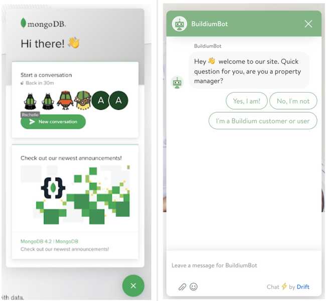
As technology evolves, it’s becoming easier to integrate AI-powered chatbots for your services using open APIs. Chatbots are not only fun and interactive, but you can program them to self adjust and provide a personalized user experience.
Chatbots are snappy, always available, and you can use them in lots of creative ways. Interacting with a chatbot not only improves user engagement, but also attention span.
This is the new way of FAQs, user can have a more human-like conversation with the service provider or the company. This increases user engagement and helps to understand the user requirements, challenges, limitation, and their solution. Sites like Mongo DB, Buildium have used with the best integration and user-oriented.
Serif on Screen
With the rising of the san-serif fonts in digital use, reading the bigger content was so much difficult and line jumping. So to create the book-like reading experience designers are using the serif fonts in their websites. This helps to create the hierarchy of the contents with their heading and body.
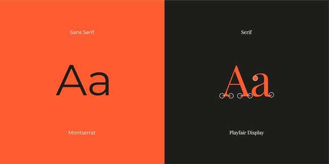
To solve the problem with reading in the san-serif font, we can increase the line spacing and the left alignment in the body. And the titles are highlighted with the serif fonts on top.
We can have them in Few Io, The New York Times, Medium Blogs,

Bold Highlights
This is in trend for website design, links, or the portion we need to highlight in the content. Designers are using thick lines behind the text they want to highlight. This attracts the user and argue them to click or check the links.
Example:

Micro-Animation
We can see the use in the Yummygum in their CTA button. They have the subtle animation on hover and for CTA button and with the every links on their sites.
Asymmetric and Overlapping Design Layout
“The Bold and Not following rules” is now trending with the design in the web design. Designers are going beyond the convention of the grids and lines. Not following the rules that boost the way of thinking of the user toward the brand and company.
This kind of layout shows they are rebellious and challenging the conventional way of thinking. These designs convey the message of being bold and disruptive ideas.
Surreal Design and Abstract Design
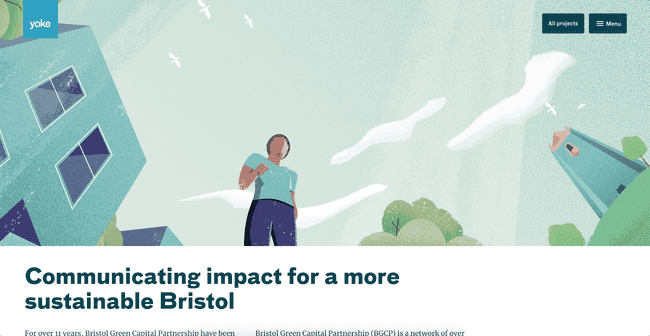
With the increase of the user-centric design, now the artistic view of the design is also used to replication the vibe and the brand values to convey the message as in the form of abstract art. This does create an emotional bond with the user, which makes them dig down in the content and the story of the website. This design enables you to create your own virtual world and the element you want to depict into it which ultimately create a better user engaging content.
Minimalism
With the principle of “Less is more”, nowadays website design is mostly based on giving the exact information at a glance. You need to decrease things that are distracting the user's views or not adding the up to the content or story you are trying to explain. With the small attention span of the users, minimalism adds up to a clear voice and directs the user to the main agenda.
You do need to be more careful while designing the minimalist, this need to bring the balance of the message you are trying to explain but not to dull down the design of your website.
It won't be a surprise to us if we see new trends after 2019 too. We saw different trends in 2019. Developers are still experimenting with new designs. So, we should be expecting to see new web trends in 2020 as well as more in the future.
At Truemark, we have developers who use the latest technology to develop software. So, if you want to have attractive designs for your software application. We can help you to develop one with the latest design trends. So, please free to contact us.
