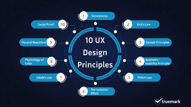
What drives users to a website or an app isn't the technology you use. Usually, they never give attention to such a thing. What compels them is the user experience and design. So, as a designer, you need to know how they perceive your software. You should understand the user's psychology. Most importantly, you need to grasp how the brain works and apply it to design a website or an app.
Understanding the user's psychology seems challenging, and it is true. However, once you get it, it will be easier for you to design your websites or an app that will awestruck them. So, are you ready to explore the UX design principles?
10 principles of UX design
Consistency
Sometimes, designers, especially beginners, make the mistake of inconsistency. They just go with the flow. However, what they should understand is that, in a few seconds, the users must be able to grab the gist of the website, like its objectives, services, and value.
Moreover, the users want the site to be simple and easy to use. Therefore, the website should be designed in such a way that drives them to do some actions.
Let's understand this with an example. Suppose a user visits your website and its background color is blue. And when he visits another page, this time he/she sees a red background color. The impression due to the inconsistency in color will make them dislike the site naturally.
You need to be clear here. While the right choice of color is perfect to attract users, the concept followed by inconsistency will leave a bad taste. As a result, the users will leave the site and may not return again.
The way your site appears, placement of text, buttons, and menu, etc., everything matters. The more the users are familiar with your site, the more they will be attracted to it, and the more smooth and flawless the user experience will be.
So, consistency is the key to a seamless user experience.
Example: Amazon

Amazon has its logo on the right side, search in the middle, and cart options on the left. No matter which page you visit, you will see the same consistency on the website. This way, the users won’t be confused. If they want to search for a product, they know where to go and what to do.
Hick's Law
According to Hick's Law, "The more the complexity and number of choices, the more the users take time to make a decision."
When a user has too many options to choose from, he can't make a rational decision. By this point, he/she is in a dilemma. As a result, there will be only two options left for him/her: quit or continue surfing. And his/her obvious choice will be to move on to another website.
From this, what you need to understand is that users don't want any complexity. You should avoid it at any cost and make it easier for users to take action. Limit the number of choices. What you can do here is categorize the elements.
For example, in an ecommerce site, you can't list all the products on a single page. Seeing the sheer number of items, the users will be confused. The decision time will increase. Instead, categorizing them will make it easier for the users to search for and get what they want easily and quickly. They will know where to search for the product they want.
Example: Amazon
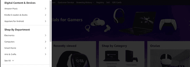
Amazon categorizes every product rather than listing them on the same page.
Gestalt Principles
According to a German psychologists group, "Gestalt principles focus on how people perceive and interpret the world."
The principle states that our brain interprets information on how we see objects in the real world. Grouping similar elements, patterns, spacing, etc., are some of the key things our minds consider.
They categorized the Gestalt Principles into six theories.
Law of Proximity
According to this theory, "Our brain perceives objects as one when they are near to each other."
It helps users to interpret the information quickly.
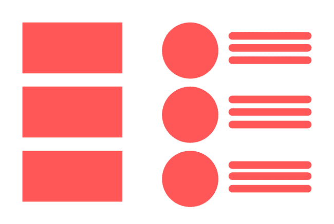
Here is an example that shows how you can use different objects perceived as unified in UI/UX design. As you can see, the above UI is divided into two parts where the right part is again divided into two sections without any grids and frames. But the users perceive them as one.
Figure-ground
According to this theory, "Our brain immediately perceives whether the object is in the background or the foreground." It helps users to differentiate between the figures and the ground on the website.
For example, the use of a CTA button, text, etc., on an overlay.
Here is an example of Netflix.

We can see that Netflix is using the law of figure-ground on its website perfectly. Text and CTA button on the foreground and image on the background. When we visit the website, our eyes first focus on CTA and text, not the background image. Here the designer has an idea of how our brain works, leaving the less important elements and focusing on what they want us to see and take action.
Similarity
According to this theory, "Our brain perceives objects as one if they are somehow similar."
Our brain perceives the above image as a rectangle even though the color is different because of its shape.
Continuation
According to this theory, "Objects that are connected by dots, lines, colors, frames, and/or shapes are perceived as one." It means our eyes will follow the smoothest path, continuing the lines, objects, shapes, etc.
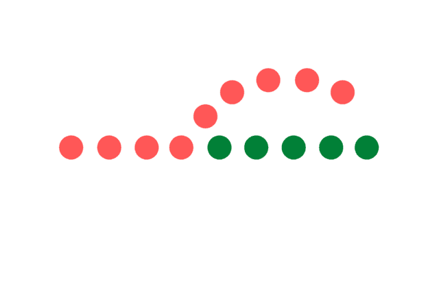
When we see the image above, we follow the straight line, even though the color has changed midway.
Closure
According to this theory, "Our brain completes the incomplete objects by filling parts itself by perceiving how they look."
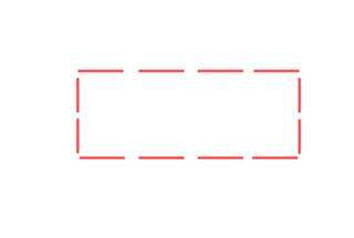
What do you see above? Rectangle, right? Even though the object is missing some parts, we still perceive it as a rectangle.
Here is another example.

Symmetry
According to this theory, "The symmetrical objects are perceived as one." The law states that the human prefers symmetrical elements rather than asymmetrical ones.
Example: Pepsi

This is the old logo of Pepsi. When we look at it, we don’t see it as two different symmetric objects. Even though they are separated by the white element, we still see them as one because that is how our brain works.
Aesthetic-Usability Principle
According to this principle, "The humans prefer designs that are aesthetically pleasing." This is because they perceive such designs as usable and more user-friendly. However, they tend to forget and tolerate minor usability issues when confronted with a beautiful interface.
For example, when a user is asked to surf a website. Let's say it is beautifully designed with some minor issues on the site. But when he/she is asked to give a review, most of the time, the first thing he/she will tell you is how fantastic the site's interface is. He/she won't tell you about the minor problems. Because aesthetic under shadows the functionality and usability.
Let’s take an example of the Iphone and Nokia. Which do you think will people prefer? Obviously, Iphone. Even though it is expensive, people will still choose it because it looks stylish and gives you a premium feeling. Here, people favor design over the price.

Fitts's Law
This law predicts that the time required to move to a target area is a function of the ratio between the distance to the target and the size of the target.
In other words, according to Fitts's law, "The size of the target and distance of it from the users' current position affects the overall user experience."
For example, the size of a button on a website. The bigger it is and the lesser the distance is, the easier it is for users to click it. But when the same button is smaller and far, it takes time for a user to press it. So even though there is only a fraction of the time difference, there is still a delay in action.

Here, it is much easier for users to click the red button because of its size (on the right side).
Besides size, Fitts’s Law also emphasizes hand-eye coordination. It is basically about how much time it takes for a user to reach a target to take action.
The Isolation Effect
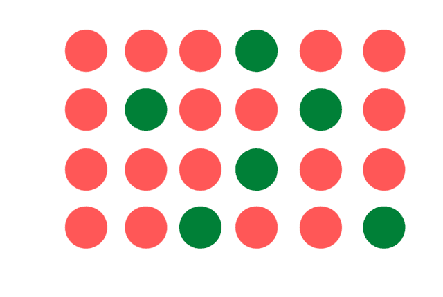
It is also known as the Von Restorff Effect. According to this principle, users give attention to those objects that differ from others when similar elements are grouped together. It means the distinctive element in a group grabs the attention of humans immediately.
See the image below to understand it better.

When you see it, the red apple immediately grabs your attention, right? It is because it is different from the rest in the aspects of color.
Here is another example.
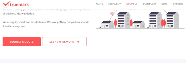
Here, on Truemark’s website, “Request a Quote” stands out more than the “See How We Work” button because of its color. It prompts the users to take an action.
However, color isn’t the only factor. Shapes, positions, textures, etc. also play a major role.
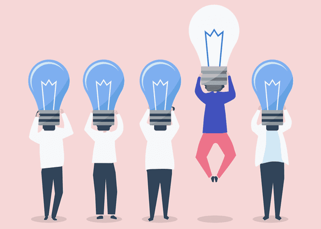
Here, the position and the shape differentiate the floating man with a bulb from others.
Jakob's Law
According to this principle, "Since users spend most of their time on other sites as well, they want your website to work similarly."
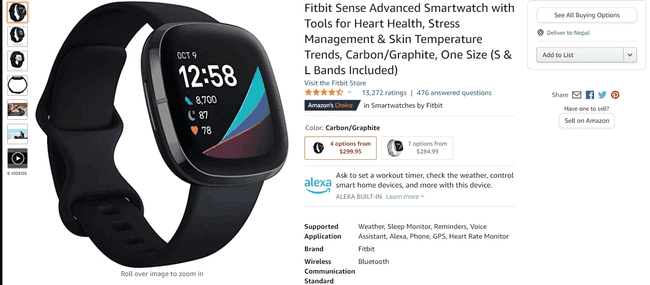
For example, if you plan to develop an app like Uber, the users want to have features like search, navigation, fare calculator, etc., on your app. They will have the same expectations from your app. They want some of the functionalities they are familiar with Uber on your product.
Let’s take an example of an ecommerce site. We always see the product's image on the left side and the product’s detail on the right size. When you build one for yourself, it is wise to consider a similar layout. And that is what many users expect it to be.
Example: Amazon
Psychology of Color
Color is one of the key fundamentals of modern web design. Colors affect the perception of the users. It draws their attention. Without them, you can't expect a website or an app to look aesthetically beautiful. Can you imagine what our app would look like without colors?
Websites with vibrant colors, but relaxing to eyes are preferred by the users. But, it doesn’t mean that sites that use less color combinations aren't liked by the users. Dark Mode is one of the best examples to prove it wrong.
However, the websites that use the right combination of colors stand out from the rest. It grabs the attention of the user quickly, leaving an impression on them. Moreover, it increases the brand recognition and compels the users to share it with people. So, it is essential to focus on colors as much as you do on your app's functionalities.
Below is a great example by KitKat.
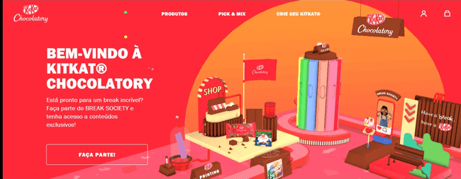
The website is colorful and bright yet gentle to the eyes.
Another great example is Facebook. When you think of it, what color comes to your mind? Blue, right? It is the primary color used by Facebook.
Colors not only grab users’ attention, but also help users connect with the business and take action.
So, choose the color combination wisely to generate more leads.
Visceral Reactions
You visit a website, and instantly you love it. Ever happened to you? If yes, then this is known as Visceral Reactions. It is a reaction by our brain that triggers it when we see a thing and immediately fall in love with it. And this is precisely what designers do to attract users and provide a seamless user experience. That is why some sites leave a mark, and some don't.
Why do you think micro-interactions, animations, transitions, 3d visuals, minimalism, retro fonts, etc., are gaining traction lately? Because people love it. Designers know this, so they design what looks beautiful to the users and attract them.
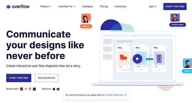
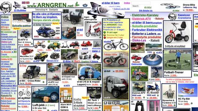
What do you think of these sites? Which do you prefer more? Your obvious answer will be the first one. Because the color combination, the UI, the text, the buttons, everything is designed in such a way that it grabs our attention immediately than the second design.
Social Proof
97% of consumers say that online reviews impact their buying decisions.
There is always hesitation among the users whether the website is trusted or not. How reliable are the contents? Users always think twice before entrusting the source. And this is where the reviews, ratings, and testimonials come into play. They play the role of authentication. They convince users before taking any action.
Moreover, people trust the opinions of experts and influencers since they have more knowledge than the everyday person. Sometimes, a big figure, like celebrities, sports players, etc., also impacts the buyer’s decision. So, it is crucial to have ratings, reviews, and testimonials on a website to gain user's trust and make them act.
Do you know about Uncyclopedia? It is an alternative to Wikipedia. However, when we need information, we rely on Wikipedia. Why is that? It is because most of the people recommend and rely on it. Everyone trusts the information provided by it. So, when people rate something higher than others, we tend to believe it and prioritize it.
Recently, Cristiano Ronaldo's action impacted the sales of Coca-Cola. In a press conference, he picked a water bottle by setting aside two bottles of Coca-Cola, which led to $4 billion loss to the brand.
Besides these, here is another perfect use of testimonials by HubSpot.
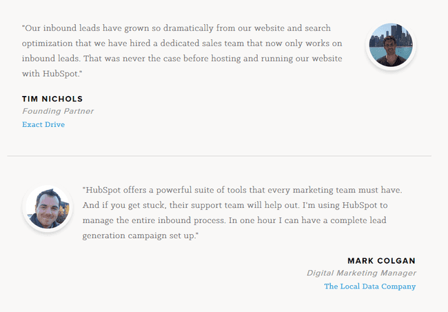
These quotes by customers persuade other users to take the services from HubSpot.
The testimonials, reviews, and ratings such as mentioned above help boost the brand recognition. So, it is wise to use them on your site.
In Conclusion
A designer should always know what makes the design and user experience seamless and outstanding. Chances are you might have difficulty in finding what's best for the users. But with research and experiments, you will have no trouble providing the best experience that the user wants.
And to know what attracts users and influences them, you should consider the principles mentioned above. They will guide and help you in providing a flawless user experience.
Keeping all these principles in mind, Truemark will help you design and build user-centric websites and apps.
References: Wikipedia
